Another week, another crash : gold tarnishes

21 Apr

Last week I highlighted some interesting goings on in Japan.

Big Falls in the Price of Gold

You’d need to be living on a desert island not to have read some headlines regarding gold over the past few weeks. In this post I’m going to take a closer look at the move, and consider it in the context of gold volatility.

First, lets put the moves into context. We saw a 5% fall in the gold spot price on Friday 12th April, followed by a 9% fall on the following Monday. These were massive moves by any measure : the 20 year standard deviation of daily price changes is around 1%, so the move on Monday 14th was a 9SD event. Such a large fall had not happened in the last 20 years. An increase of that magnitude had happened only once, in September 2008.

The chart below visualizes the daily moves in the gold spot price over the last 20 years. We can clearly see the recent outlier – that’s one big move!

GoldI

Furthermore, recent volatility had been quite low. The chart below shows the 1-month realised volatility of the gold price as well as the 1-month implied volatility (a measure of the market’s expectation of the volatility over the next month). Both had been high at times in the past, but had, prior to the recent falls, sunk to the lowest levels we’ve seen in the last 20 years.

High Volatility a new ingredient

GoldII

In fact, implied and realised volatility had fallen to around 10%, meaning on 14th April we got roughly a whole year’s volatility in one day! Both measures of volatility have, not surprisingly shot higher following the move, which means we should expect a period of larger swings in price.

Looking at the relative changes in price so far this year (chart below), across a few different indices, we can see that while the gold price initially rose early in the year, it began a downward trend in February, in contrast to developed equity markets (which have trended higher since then) and wider commodity markets (which are broadly unchanged since then).

However the recent extreme falls in the gold price have fed through into other markets, with developed equities losing around 3% in total over the last week.

GoldIV

So far so familiar, probably. My point is that if we dig a little deeper into the gold volatility surface, we can un-earth some interesting facts.

Gold is different to Equities

Without getting too detailed, a volatility surface measures the price investors are willing to pay to insure against moves in the value of an asset. It also tells us about the possible direction of such moves. Equities for example almost always have volatility surfaces that are skewed toward put options – investors are worried about large falls and prepared to pay more for options that relate to large falls than those that relate to large gains. We know from experience that a large fall in an equity market is more likely than a large rise.

Gold is a little different. As Jonathan Eley pointed out in the FT over the weekend, the dynamics of the gold price are interesting. While it might be an inflation hedge over long, long periods, its day-to-day dynamics  suggest it doesn’t always simply behave simply like a “safe haven” asset. Its volatility surface can be interesting too. Below I show the volatility surface at three different points in time.

Firstly, during August of 2011, a period of time where there was considerable stress in the markets. We can see that the volatility surface slopes upward from left to right – indicating that investors felt that at this point in time large moves in the gold price were more likely to the upside than the downside.

The second volatility surface is in the middle of last year. The surface has flattened – investors felt that large moves in the gold price were equally likely in both directions.

Finally, I show the volatility surface as of the middle of March this year (a full month before the big falls in the price). Interestingly, for short maturity options, the gold volatility surface had become downward sloping – investors had begun to feel that were a large move to take place, it was more likely to be on the downside than the upside.

Gold III

Takeaways for investors 

Well, gold is an interesting asset, with quite different dynamics to other asset classes. Sometimes it can “look” like a safe-haven asset which investors rush to in times of crisis, causing large upward surges in price. Other times it can look like a risky asset, and experience large downward moves in price.

Gold “bulls” will cite the fact that gold has supposedly retained its purchasing power over thousands of years, John Paulson famously runs a large proportion of his vast c$10bn of hedge fund assets in gold based share classes (as opposed to USD or EUR currency). Others will point out that recently gold lost 10% of its purchasing power in a single day, or 20% so far this year – how can that be a safe haven ?

I think the conclusion for investors is to be very clear about the role of gold in portfolios. The view that an investor is expressing by being long gold is

(1) expectations  of cyclically much higher inflation – the sort generated by quite extreme shocks or changes in environment, perhaps as high as double digit per annum rises in price indices.

(2) expectations of the failure/end of a FIAT money system of currency and a return to the use of precious metals as a medium of exchange.

An investor which holds these views and expresses them through being long gold, then clearly has to accept some considerable possible volatility in that position compared to one measured in a FIAT money currency such as USD or EUR.

An eventful week: focus on Japan

8 Apr

Image

It was an eventful week for financial markets last week : new price index highs for the S&P 500 were followed by a disappointing jobs report which triggered a small sell of in most developed equity markets. There was also a broad fixed income rally across markets with Italian and Spanish yields sent around 40 bps lower by ECB comments, and long end gilt yields pushed around 10bps lower on Friday alone. 50 year UK linkers now trade with a real yield of around -0.25%.

However, the real excitement was in Japan.

In a previous post I highlighted the stellar few months the Nikkei had enjoyed at the end of 2012 and the start of 2013, this had been caused by the general stimulatory stance of the new government, and went hand-in-hand with a weakening of the yen which traded from a high point of around 80 to the US dollar in late 2012 to around 90 to the USD dollar by March 2013.

This was just the first part of the story.

As has been widely reported, the Bank Of Japan last week announced a huge program of bond-buying, expanding both the size and duration of the BOJ’s balance sheet, markets responded sharply.

As shown in the figure, the Yen weakened sharply against the dollar, by almost another 5% from a level of 93 to the dollar to around 97.

The Nikkei rallied another 3%.

What was more interesting was the behaviour of the JGB futures market, this has seen quite wild price movements in the last few days as highlighted in this piece by zerohedge. The price swings have been so extreme that circuit breakers caused the exchange to halt trading in 10 year JGB futures, two days in a row. The net result has been a sharp move higher in the 10 year JGB yield (about 5 bps higher, vs a yield level of 0.5%) and lower in the total return index. the moves in the level of the futures price were significant,around 1-2% in a price that had experienced annualized volatility of only 3-4% over the last ten years (Friday’s move was roughly a 6 standard deviation event based on the previous 10 years of daily data).

VIX on this day

26 Mar

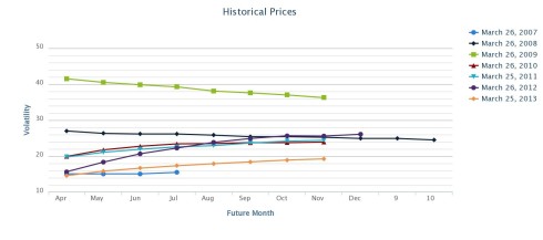
The chart attached illustrates the level of the VIX, and VIX futures curve on March 26 in each of the last 6 years (source: Vixcentral.com), and although it doesnt include some of the earlier history of the VIX, its pretty interesting.

VIX On this day

A few observations jump out :

– The current level of the VIX and VIX futures curve is pretty similar to where it was in March 2007, other than a slightly more upward sloping futures curve now implying a higher cost of carry of a long VIX futures position

– Indeed the development of a clear upward- sloping bias to the VIX futures curve is something that’s happened since 2009. No doubt the launch and strong asset inflows into VIX ETPs such as the VXX, which follows a systematic strategy of buying VIX futures have fuelled this

– Its quite surprising looking back that in March of 2008 there was actually a downwards sloping bias to the VIX futures curve, perhaps an indication of the complacencies that existed at that point in time.

– The most upward sloping futures curve of the time points studied was in 2012, where there was a massive 7 volatility points difference between the first and fourth futures (15 vs 22)

– what we saw between 2010 and 2012 was overall a very slight move down in the level of the VIX and the front month futures (although with notable spikes in May 2010 and August 2011 – see second chart), but the longer term futures remained at eleveated levels

– What we’ve seen in the last 12 months are these longer term VIX futures also falling, the VIX itself has also fallen, but by much less

VIX0713

Currency VIX and Equity VIX Divergence

18 Feb

In a sea of declining volatility, worth highlighting the (slight) counter currents within the FX markets.

The CVIX index is a measure of the weighted average 3 month implied volatility of about 9 of the major currency pairs, mainly USD pairs with a few EUR crosses.

As shown in the attached chart (as at 18 February 2013, source: Bloomberg) it largely moves in tandem with the VIX index, however since the turn of the year rather than continue the march downwards, it has slowly ticked higher.

This stands to reason economically of course, while central banks’ loose monetary policy and ample liquidity provision serve to dampen down volatility in other asset markets, these policies can lead to depreciations (and expectations of further depreciation) in the currency markets, leading to investors and traders paying slightly higher premiums for protection against one currency depreciating against another.

this year this has particularly been the case for the JPY against the USD, and also sterling against the USD. both of these pairs have seen their 3 month implied volatility rise since the start of the year. the same is true to a lesser extent of the EURUSD. These three currency pairs are among the highest weighted in the CVIX index.

VIX CVIX

The Nikkei

4 Feb

A lot has been written about the equity market rally in the first month of 2013, no need to repeat the obvious here. What is worth mentioing though is that the Nikkei index has been one of the biggest beneficiaries of the bullish start to the year. That comes on top of big months for the Nikkei in November and December 2012, meaning that it has returned a staggering 30% since 11 November 2012 (see first image).

The Nikkei index : 30% higher than its level on 11 November 2012

The Nikkei index : 30% higher than its level on 11 November 2012

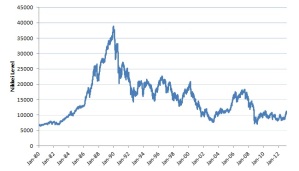
However, before we get too carried away when it comes to the Nikkei its always worth remembering it still lies massively below the highs reached in the early 1990s.

Nikkei : still a long way below early 1990s levels

Nikkei : still a long way below early 1990s levels


Financial Conditions : Back to early-2007 levels ?

22 Jan

Financial Conditions : Back to early-2007 levels

According to Bloomberg’s US and European financial conditions indices, which take into account a range of indicators of market stress, financial conditions have recently moved to their most benign level since early 2007 (source: Bloomberg)

What’s more, almost all the underlying components that feed into the two indices (spreads between lending levels of different maturity and security such as OIS / LIBOR, or between the yields on governement bonds and swaps, equity and credit market levels and volatilities) are at or close to the most benign levels we have seen over the last ten years(source: Bloomberg).

FinancialConditionsUnderlyers

This comes at a time when realized and implied volatilities across equity and commodity markets are close to 6 year lows (for example see here).

All of this means that we enter 2013 with some of the calmest and most favourable conditions in the financial markets that we have seen for many years.

Or that’s what the indicators tell us anyway – one thing that experience has (or should have) taught us is that financial markets have a habit of springing unexpected surprises. One can argue that all the components of the Financial Conditions indices are somewhat reverse-engineered post the 2008 crisis, and focus too narrowly on the specific measures that characterized that episode; they wouldn’t necessarily capture the stresses that might accompany a crisis originating in a different form, in exactly the same way that indicators based on over-valuation of tech stocks would not have captured the stresses that materialized in 2007 and escalated in 2008.

Chart of the Year 2012

14 Jan

Naturally, there are many, many charts that help tell the story of the year that was 2012 in financial markets. But, if I’m forced to pick a single one I’d have to go with this particular chart and the story it tells of Spanish and Italian government borrowing costs over the course of the year.

Its no secret that continued issues in the Eurozone have defined the past few years, and at certain points it has looked like Spain and Italy were going the way of Greece, Portugal and Ireland. Italy started the year with its two year bonds yielding nearly 5%. However during the first five months of the year borrowing costs for both countries stabilised and fell, to around 2% by May 2012. A period of uncertainty and volatility then followed, as a number of financial market and political issues played out. Italian 2 year borrowing costs exceeded 5% by July 2012, and Spanish 2 year yields got close to 7% – a level which when it was exceeded by Portugal and Ireland resulted in a loss of access to the markets and a bailout. However the story in 2012 went somewhat differently, strong intervention by the ECB coupled with muddle-through policies from the European decision makers helped both Italy’s and Spain’s borrowing costs to stabilise and fall once again in the second half of the year, to around 2% in the case of Italy and 3% for Spain. Of course that’s not to say the underlying issues have been dealt with or gone away, but as for 2012, this is how things played out.

This drop in yields and surge in the value of Italian and Spanish government bonds laid the foundations for strongly positive returns in most equity markets (which largely posted double-digit gains) and other risky assets, particularly High Yield debt.

Spain Italy

Alternative chart of the week

13 Jan

There was a close second for this week’s chart: equity implied volatility – that is, the relative cost to protect against market falls from the current level – has fallen back to levels last seen in mid-2007, and there are several charts that illustrate this quite well. Firstly, the VIX Index as shared by @William1 https://twitter.com/Williamw1/status/289034938714554368/photo/1

Secondly, and in my view more significantly, the 1 year implied volatility of FTSE 100, S&P500 and Eurostoxx :

equityvol

The reason this is more significant than the VIX is that the VIX represents 1-2 month maturity options on the S&P 500 index, and while it is indeed at low levels, it is also true that there have been multi-month periods in the last 5 years where volatility has been realised at those low levels. However, there have not been whole year periods where the same can be said.

Of course it is true that banks and other systemically important institutions are much less leveraged and arguably better capitalized than they realistically were in 2007, however its still clear that many risks remain. One wonders however given the ability of governments around the world to effectively “kick the can down the road”, is it likely that we will see as acute a market response as we did in 2007-2008 ? If so, what will be the catalyst: plenty of event-risk has come and gone with respect to the Eurozone situation and the US fiscal situation with neither a resolution nor a substantial increase in volatility.

However, history suggests that even if we cannot identify them now, such catalysts are bound to materialise through time and more likely than not in the next year, ie during the lifetime of those options on the FTSE 100 index that can currently be bought at prices which imply a volatility of around 15% for the next year.

Aside 13 Jan

Read more about the surprise announcement from the ONS here http://bit.ly/10kFYTM

Image

UK inflation

13 Jan

UK inflation

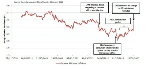
On Thursday 10th January the Office of National Statistics (ONS) surprised the market by announcing that it was not proposing any changes be made to the RPI index, prompting a big move in market inflation expectations